bistro arlo
2026, branding exercise
affinity, photoshop, illustrator
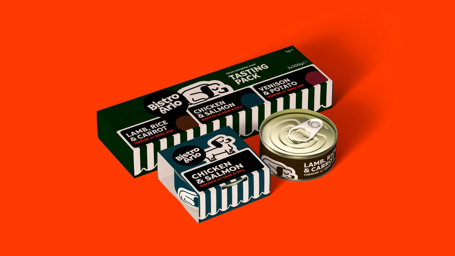
Bistro Arlo is a brand of really posh wet food for the most discerning of dogs.
inspired by French dining, great quality produce, and one very spoiled pooch.
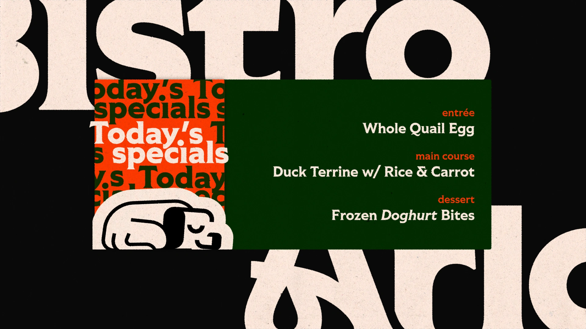
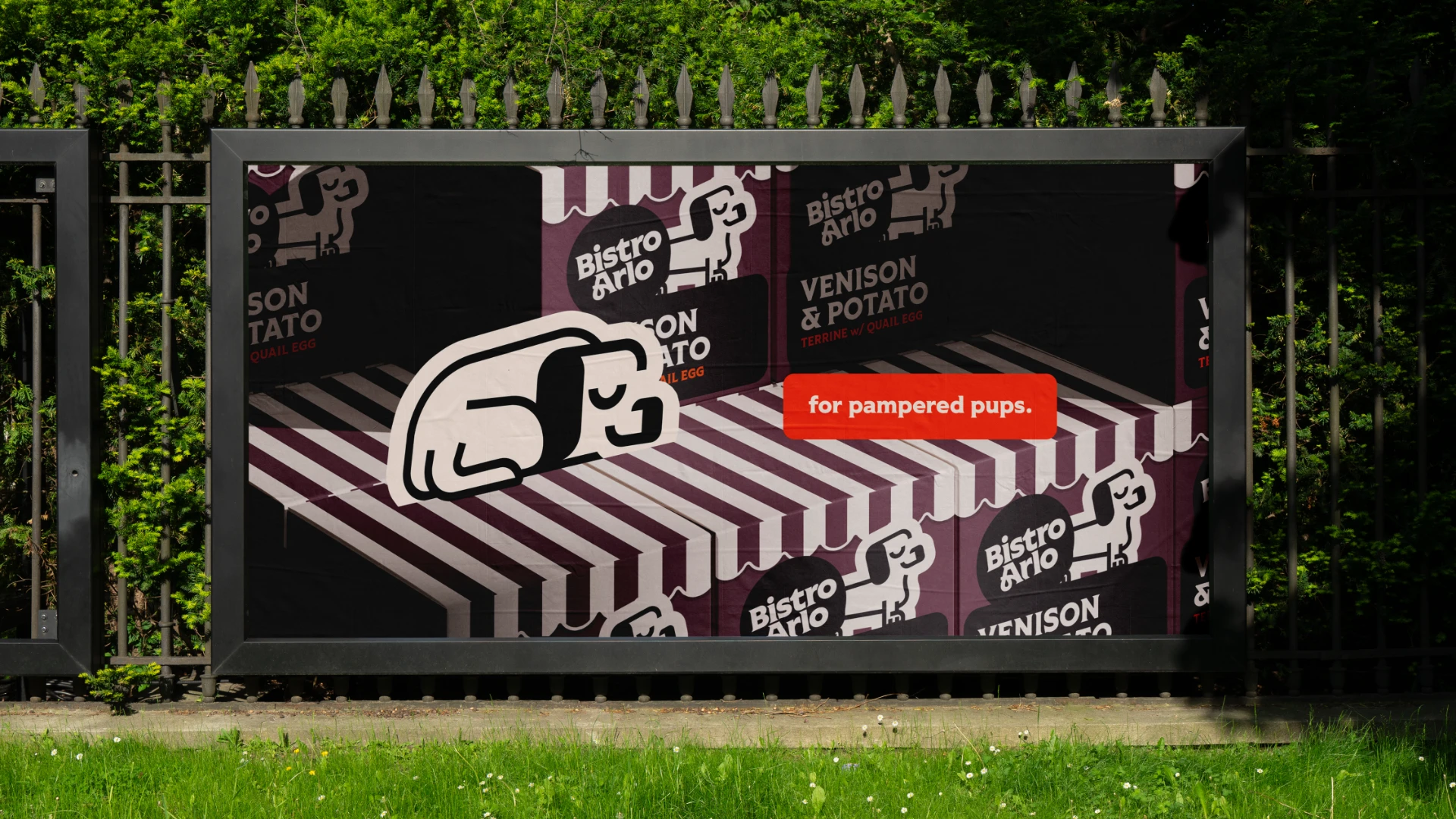
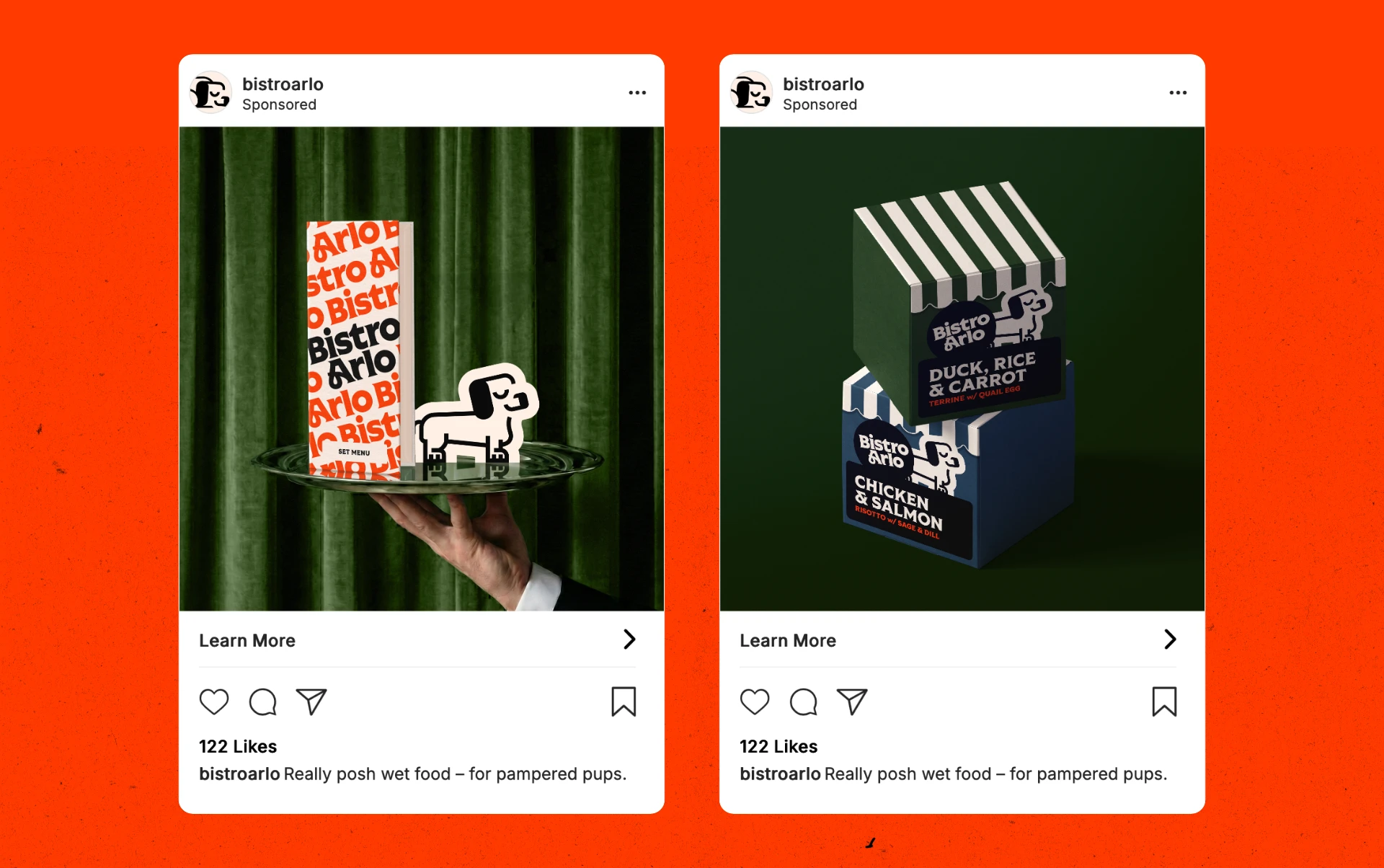
I wanted to communicate the 'fancy restaurant' theming without actually
projecting exclusivity or high pricing, so I tried to keep the more 'posh' visual signifiers limited and
more tongue-in-cheek.
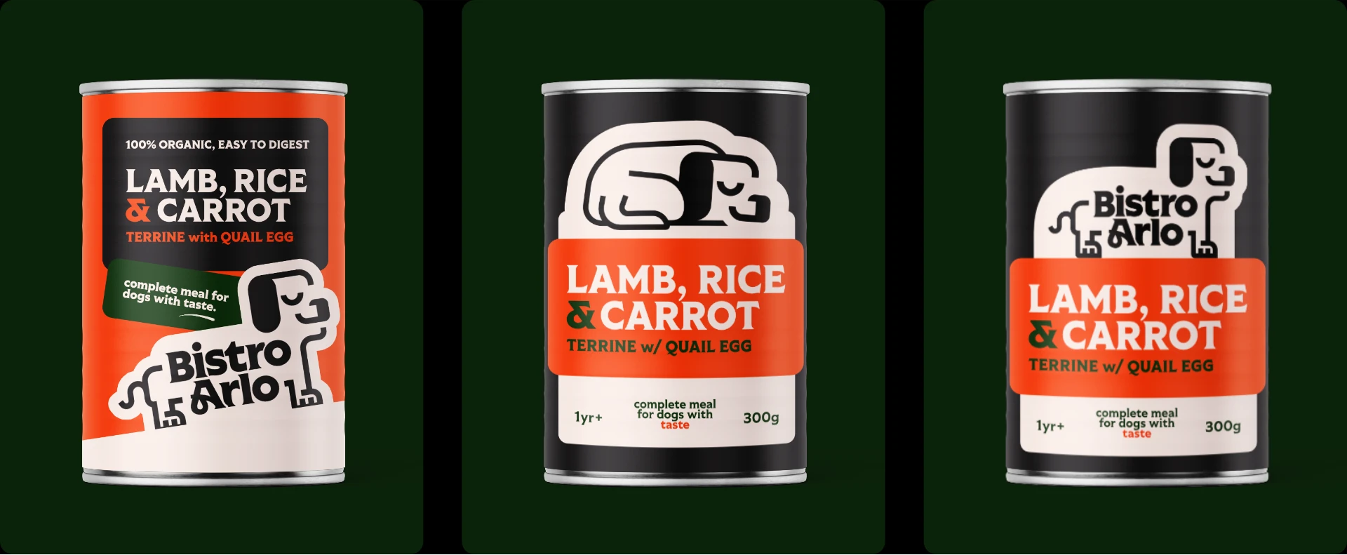
I found very early on that the illustrations I was using didn't really work in a lighter colour,
so they had to be used on a lighter background. I experimented a lot with a 'sticker' aesthetic, using
heavy layering and a looser grid.
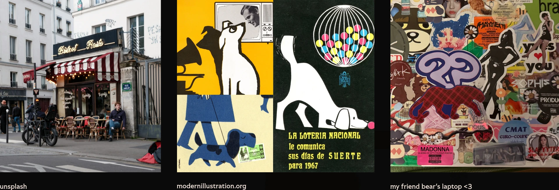
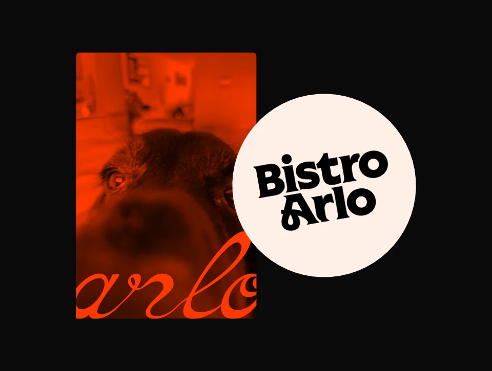
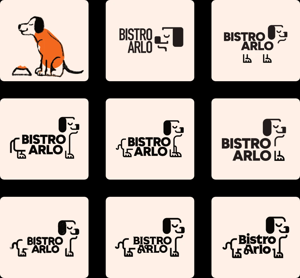
my process for the logo mark started with a sketch, which I took and turned into a more geometric vector
illustration.
for most of the project's development I positioned the logo type in the dog's figure, which was
cute but ultimately inflexible and kind of awkward, so I moved away from it eventually.
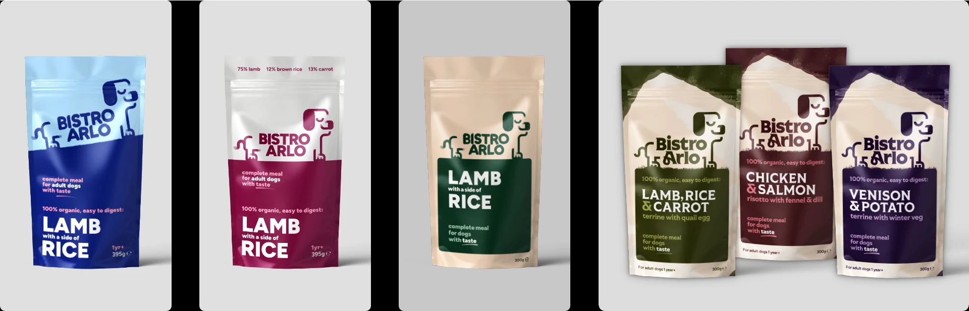
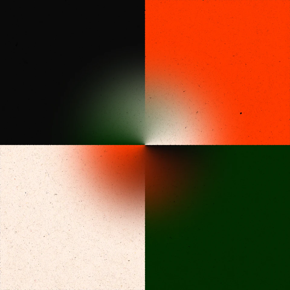
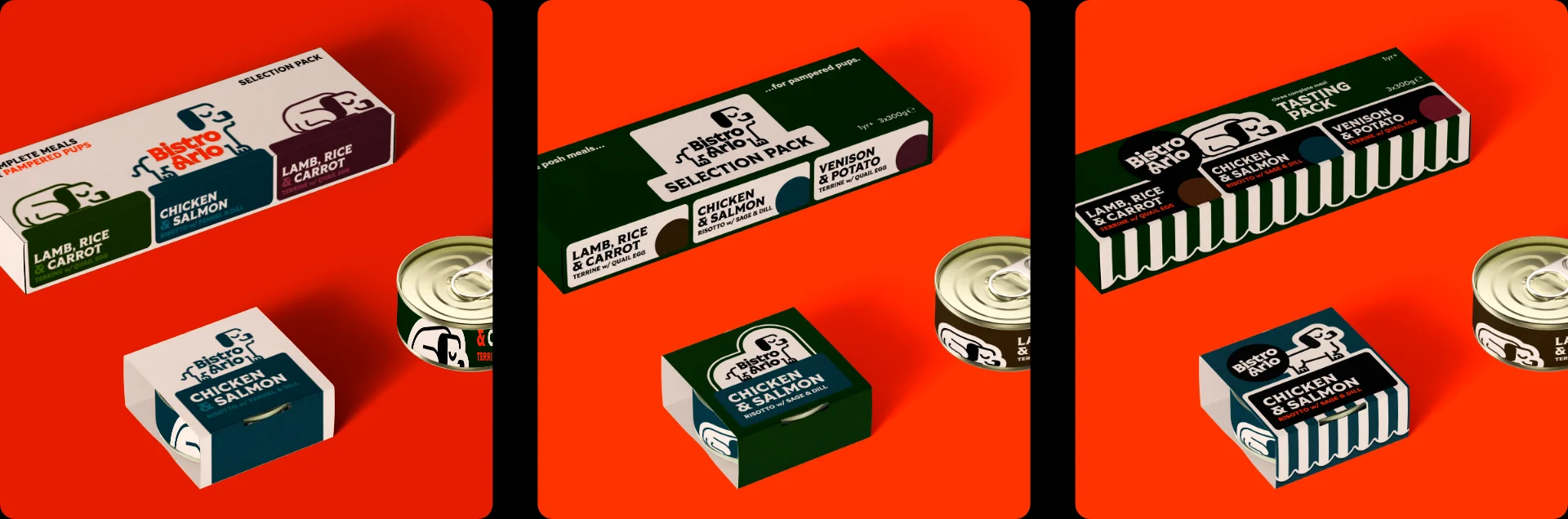
I think the project really found its stride when I committed to the final colour palette. my earlier drafts had a lot less focus; the lack of a unified palette made my earlier packaging drafts feel kind of directionless and drab.